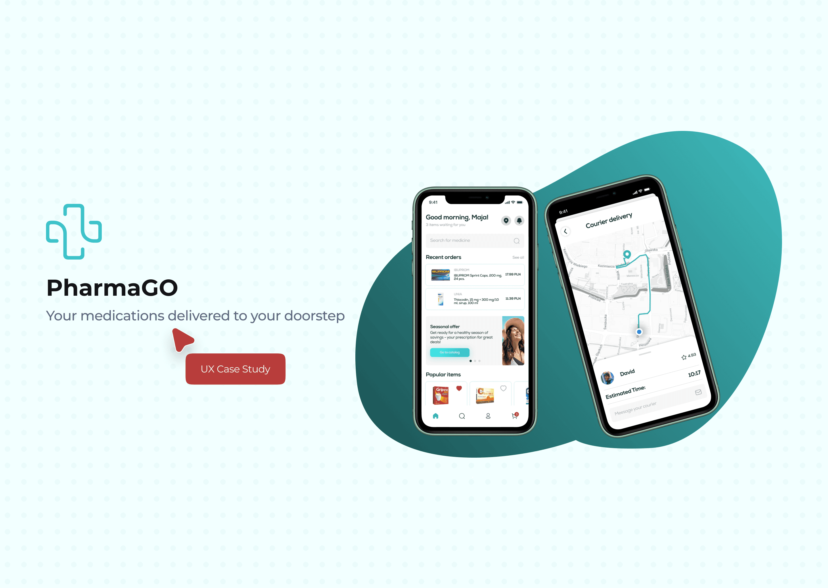
PharmaGO - Medications delivered to your doorstep
The main goal of the PharmaGO app is to provide a seamless and convenient experience for users in buying their medications. The PharmaGO aims to empower users to improve medication delivering and enchancing their overall experience.
01
Problem Statement
Traditional pharmacy experiences involve time-consuming visits, limited operating hours, and inconvenience in the event of emergencies or health conditions that restrict mobility.
02
Objectives & Goals
We aim to develop a comprehensive pharmacy app that allows users to easily order their prescription medications online and have them delivered to their doorstep via a reliable courier service. This app will bridge the gap between patients and timely access to their medications, ensuring convenience, reliability, and improved medication adherence, ultimately contributing to better health outcomes
03
Surveys & In-depth interviews
During User Research process our online survey was completed by 72 respondents, as well we conducted 5 in-depth interviews. The collected information became the basis for further UX research.
During the interviews respondents showed real experience of interacting with an already existing competitive app.
Observations & answers
🙋♀️ 73% of respondents use pharmacy apps more than once a week.
Most of them would love to use a courier delivery due to special needs.
👨💻 60% of respondents refuse to order due to the difficulty of the app.
Most of them complain about the difficulty in understanding the interface.
🙅♂️ 26% of respondents are happy with current available apps.
Many of them had to stop using these apps.
🤦♀️ 8% of respondents had no problems with ordering, shipping or returning.
Many of them will prefer to order online than go to the pharmacy.
04
What people say

"It's impossible to choose the required amount of medication in the specific pharmacy."

"It’s impossible to pay for the order online. Also, I can’t order home delivery."

"I don’t understand where my courier is, how to contact him?"

"I cannot order 1 blister instead of a whole pack of drugs."

"To create a bonus card, you have to go directly to pharmacy."
05
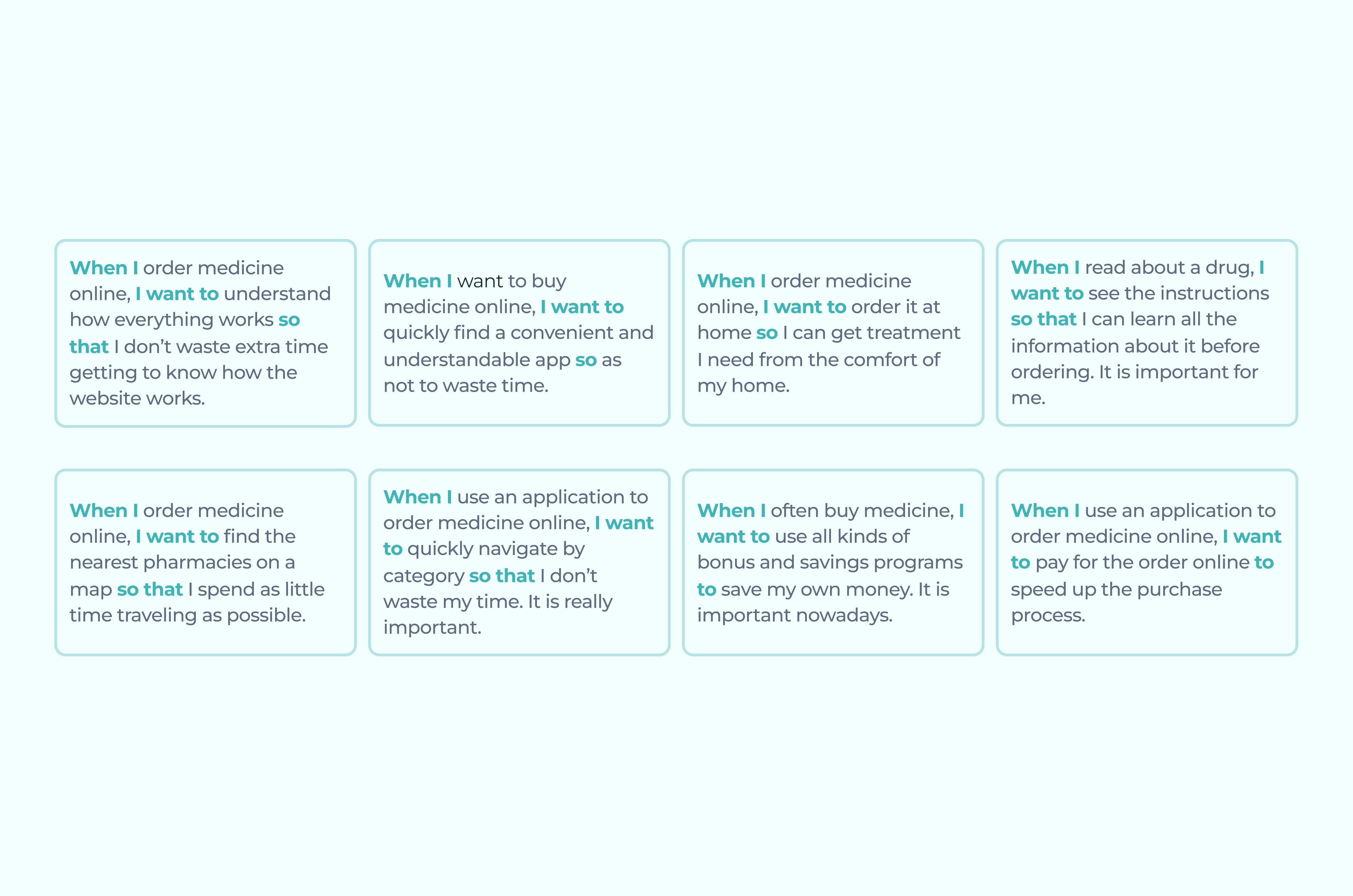
Jobs To Be Done
Due to the large and segmented audience, it is difficult to outline one User Persona.
JTBD helps to focus on the point: under what conditions a person may need your product.
06
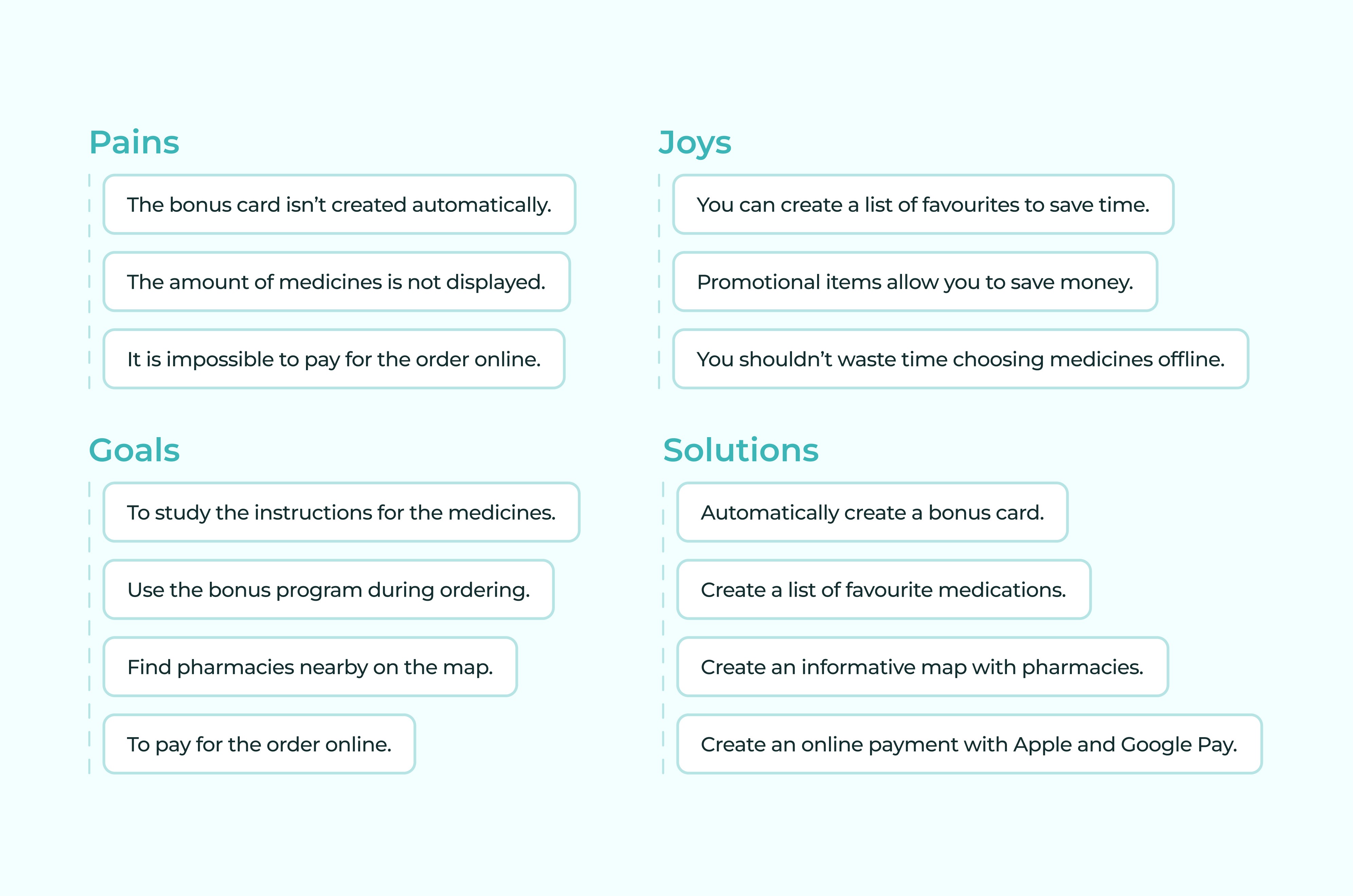
Custom Journey Map
I built a CJM based on interview responses. CJM includes customer’s actions, pain points, joys, goals and future solutions.
07
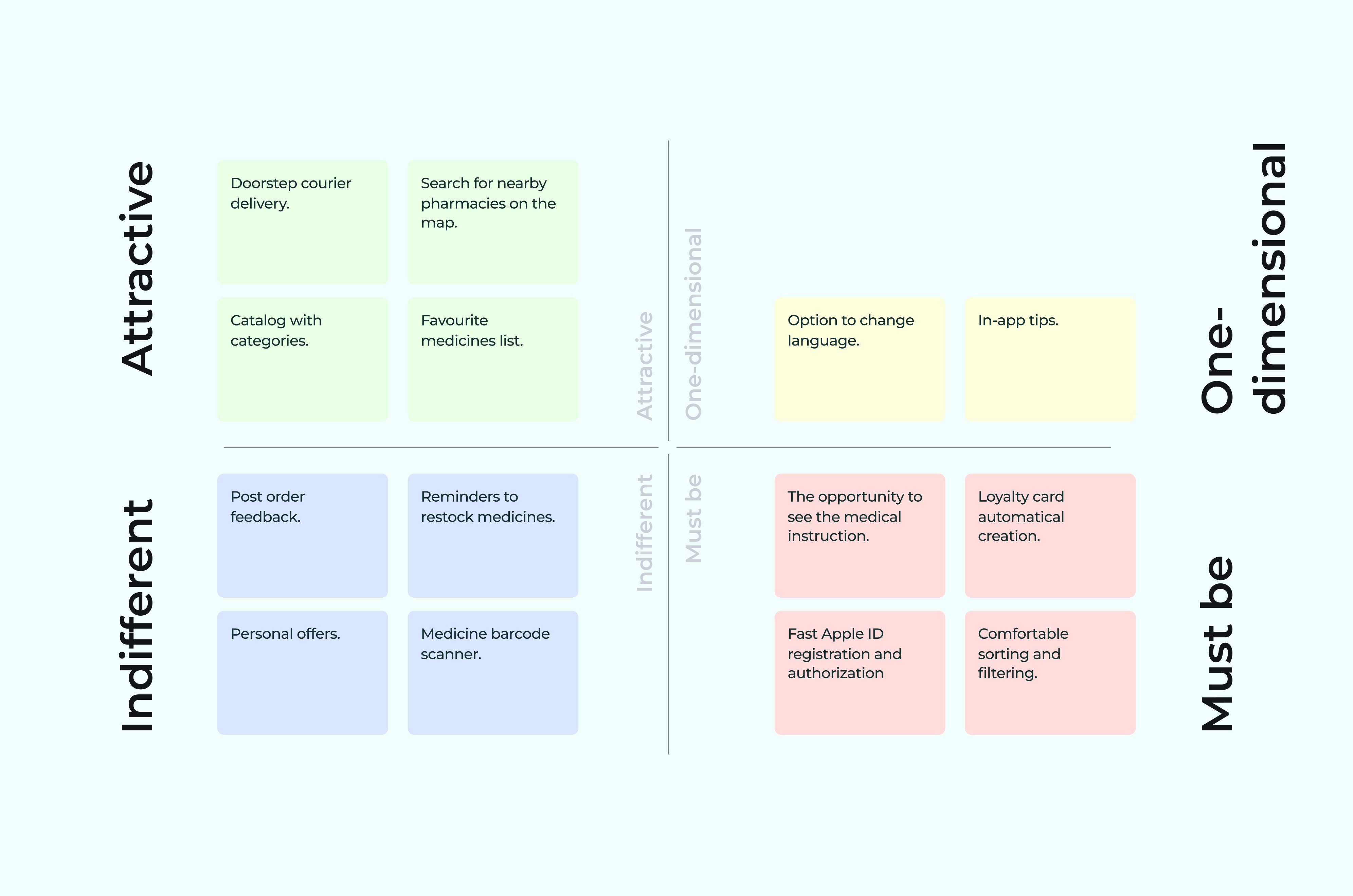
Kano Model
In our project, we utilized the Kano Model to strategically prioritize and develop the features of our application, ensuring alignment with user expectations and satisfaction.
This methodical approach allowed us to allocate our resources effectively, creating a well-rounded product that meets both the essential needs and the potential desires of our users.
08
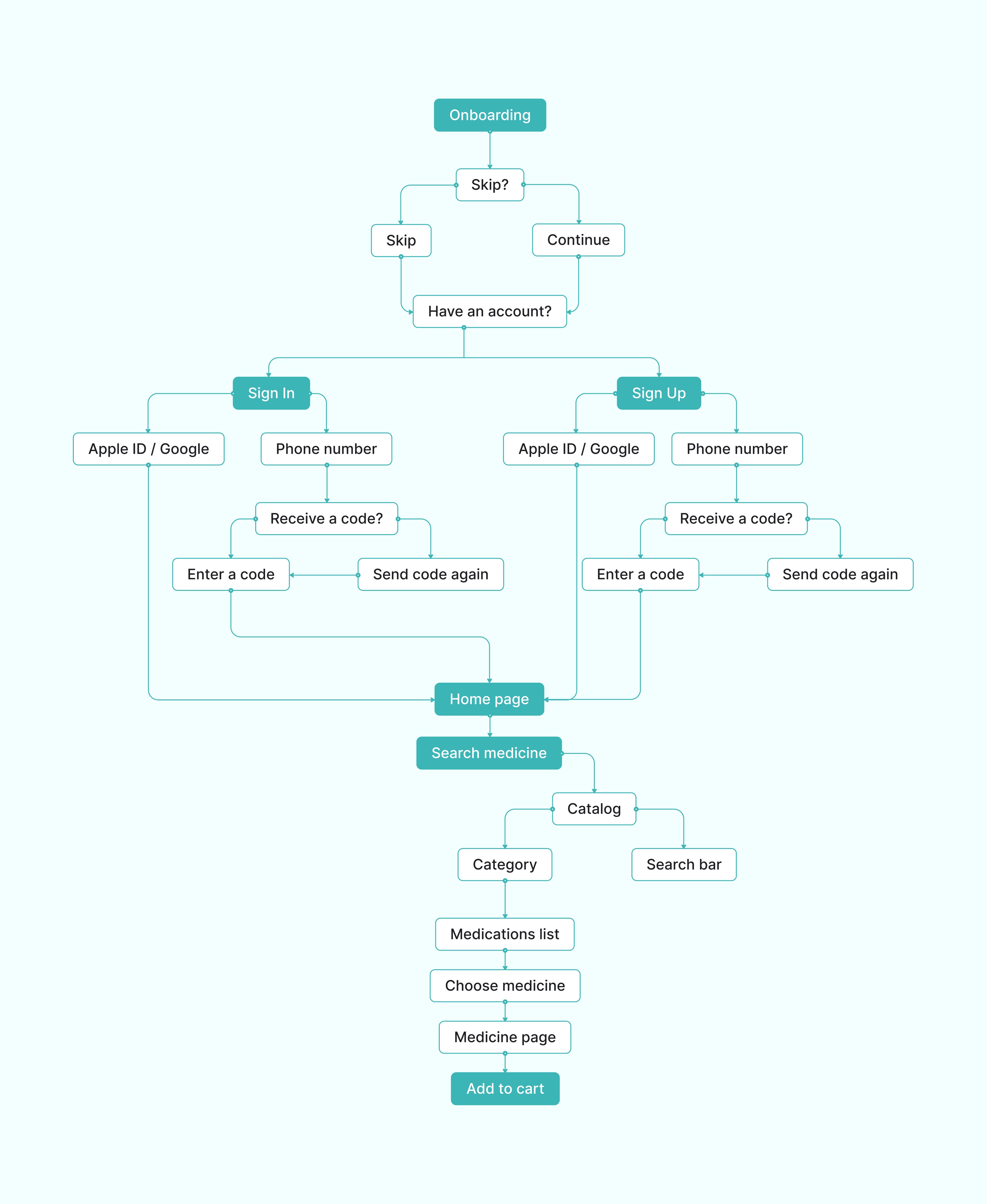
User Flow
09
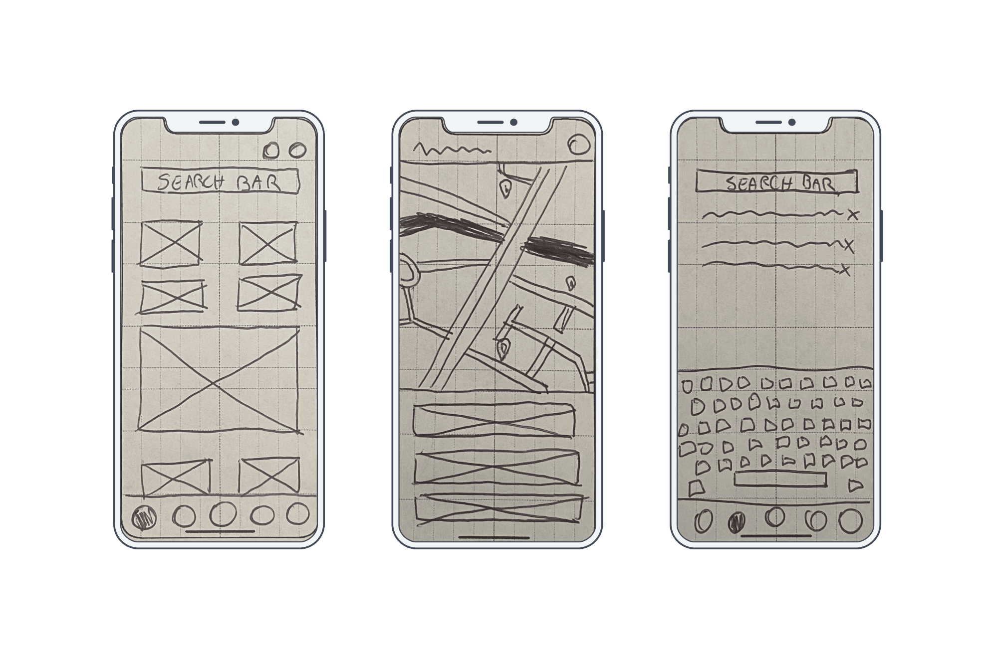
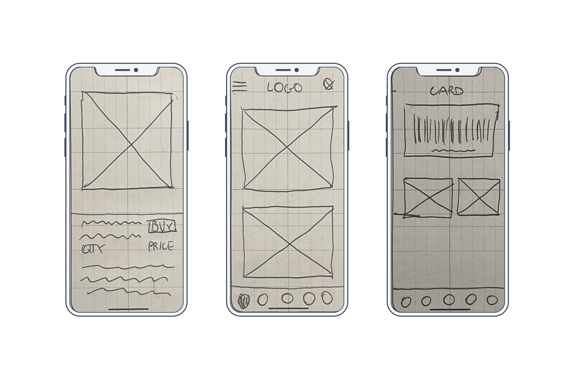
Sketches
This section showcases a series of preliminary sketches that illustrate our journey from conceptualization to refinement. Each sketch represents a pivotal step in exploring various design possibilities, helping us to visualize potential solutions and iterate effectively.
10
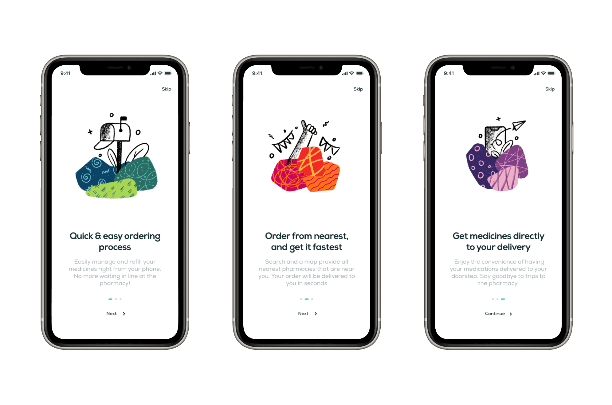
Onboarding part
First impression matter. First of all, I created an onboarding as a start UI design element.
11
Home page
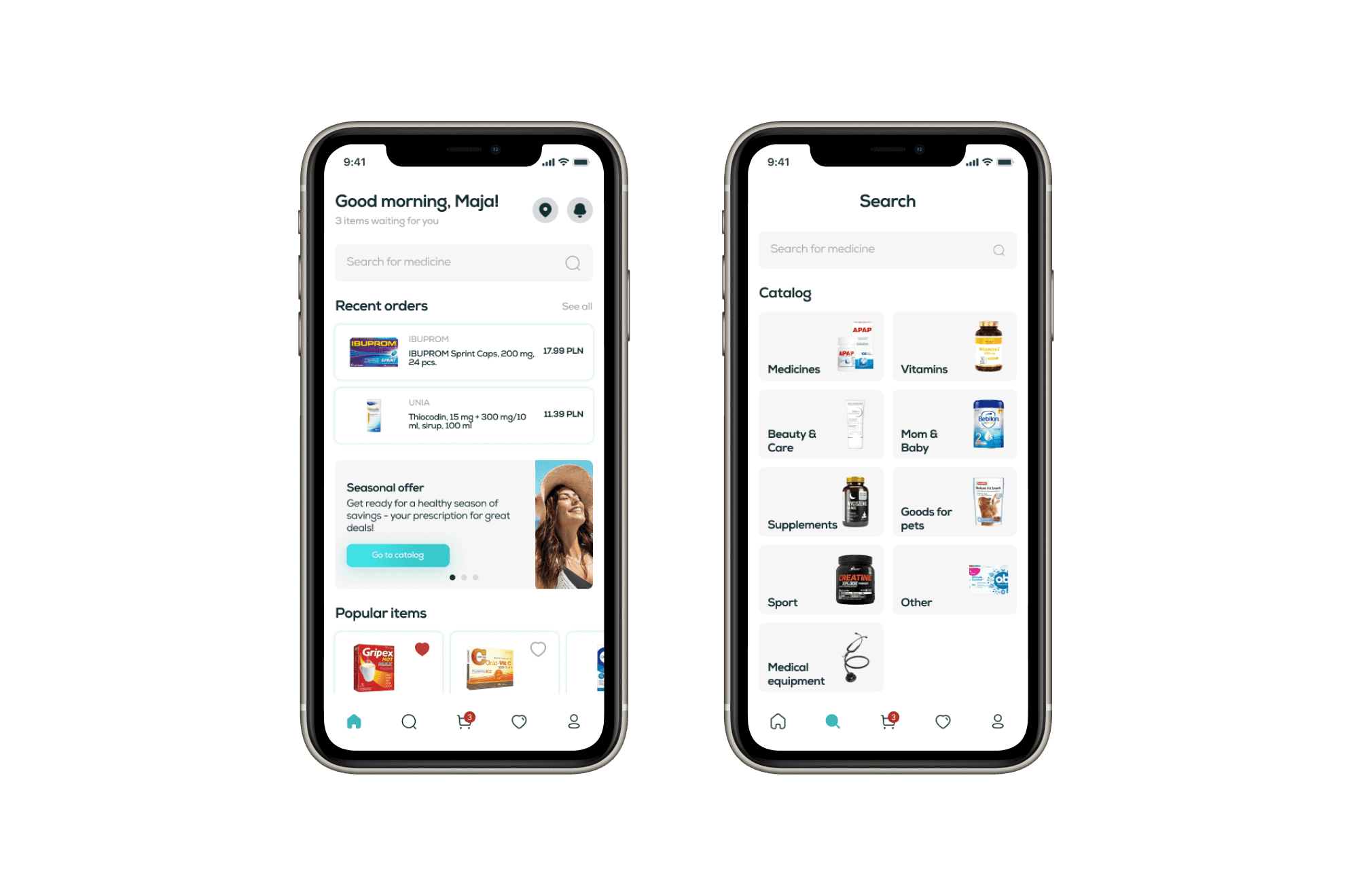
Home page design was an important part of my work. You can see a consistent and comfortable result for future users.
11
Home page
Home page design was an important part of my work. You can see a consistent and comfortable result for future users.
12
Easy to search
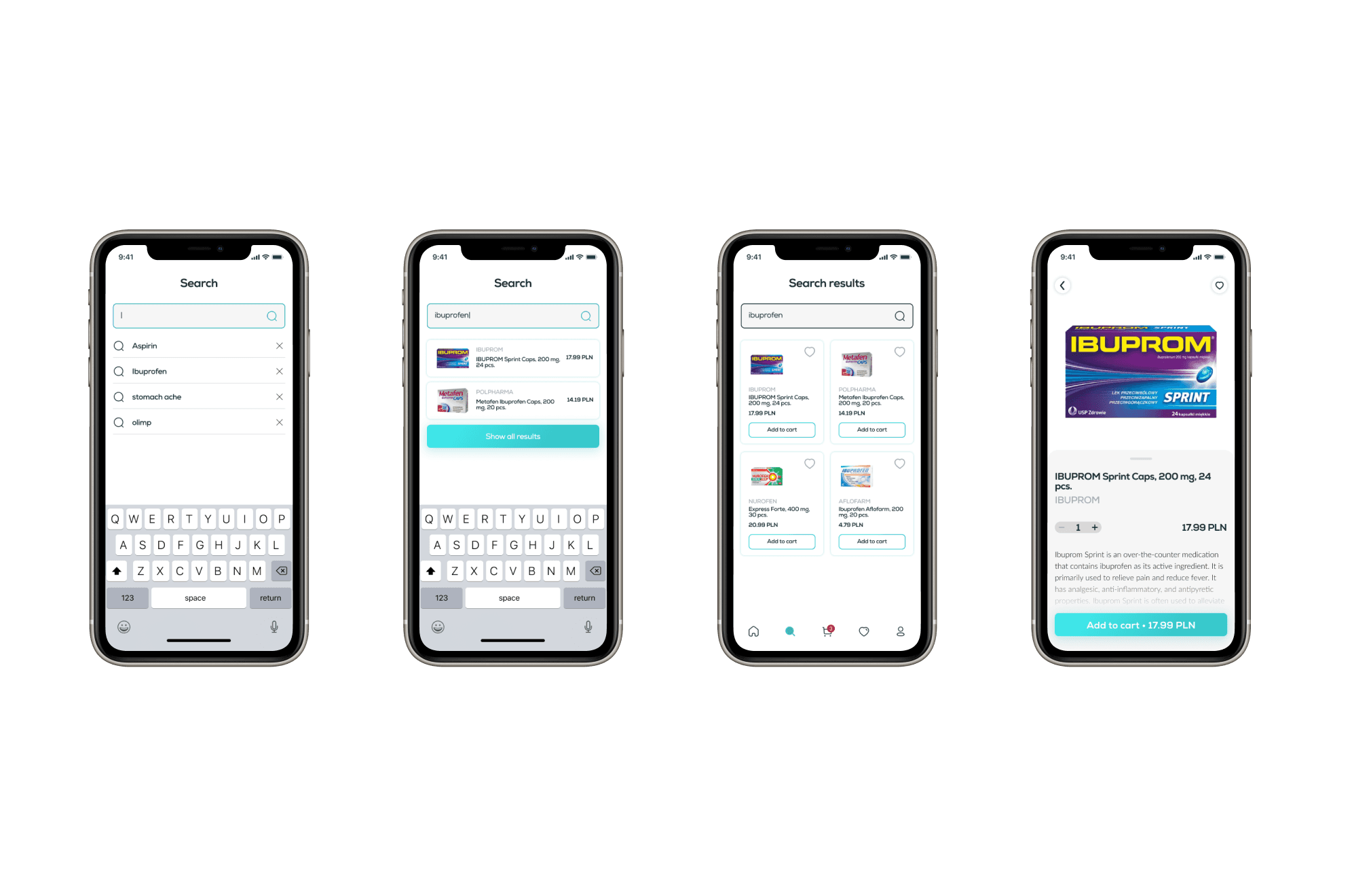
Easy and quick search for medicines is one of the main tasks of the app. Search hints and search history make the task easier for the user. I also implemented a must-have feature: a catalog with convenient visual categories.
13
Find a nearby pharmacy
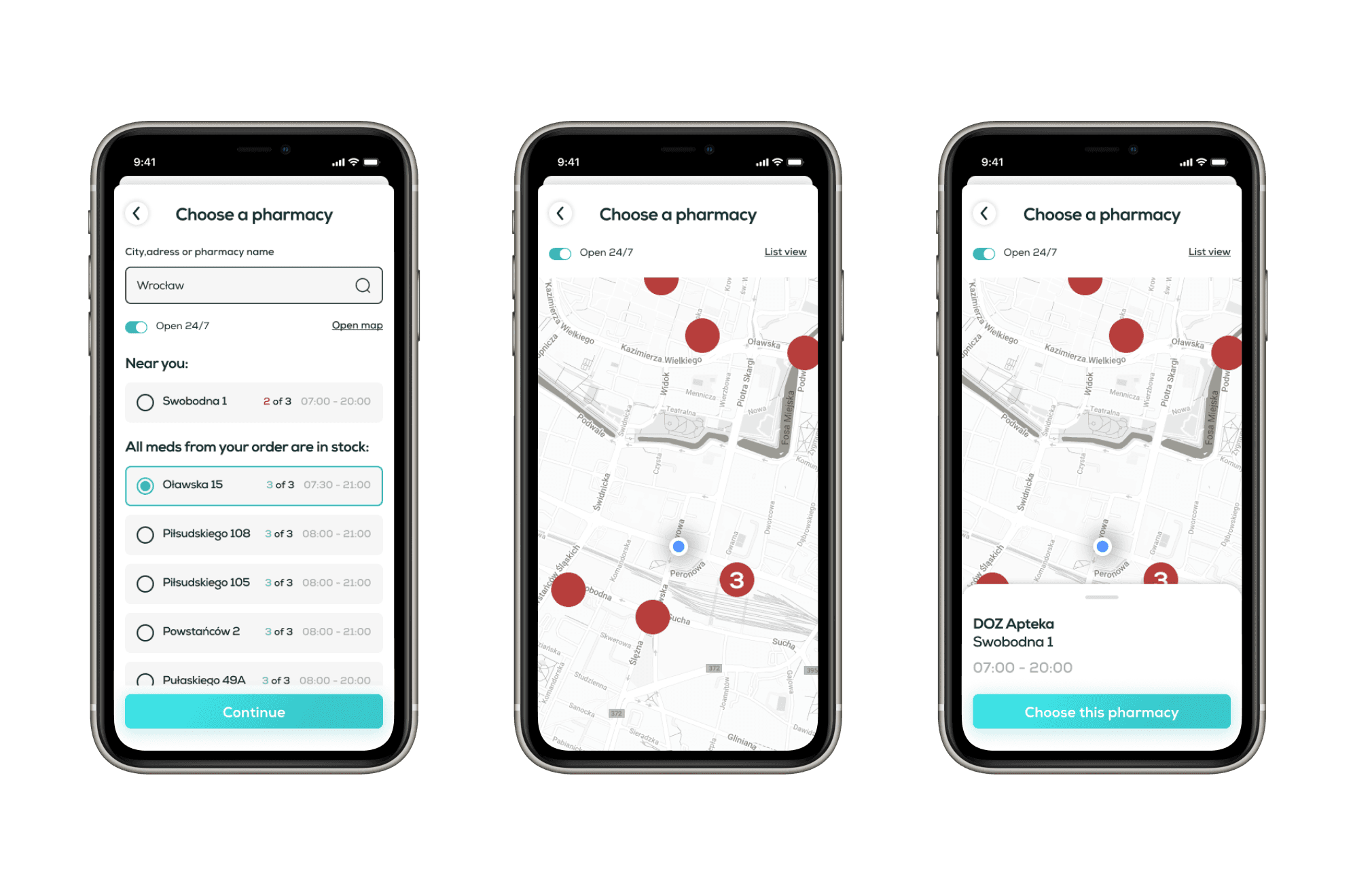
Easy and quick search for medicines is one of the main tasks of the app. Search hints and search history make the task easier for the user. I also implemented a must-have feature: a catalog with convenient visual categories.
14
Profile card & favourites
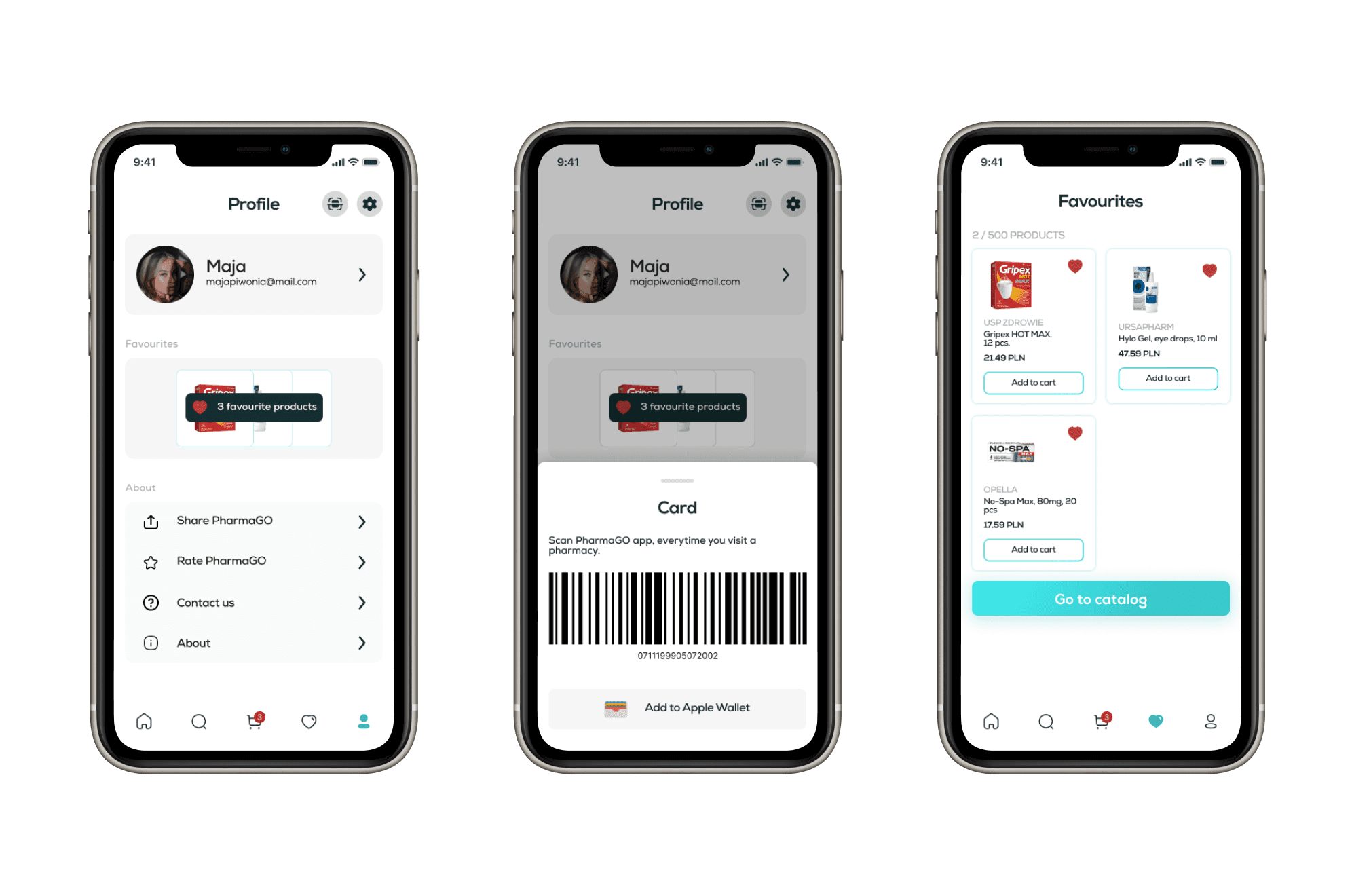
The user’s personal account must provide comprehensive sections of information. It was decided to place a loyalty card and a section with favourites in different navigations to be sure user uses all of these features.
15
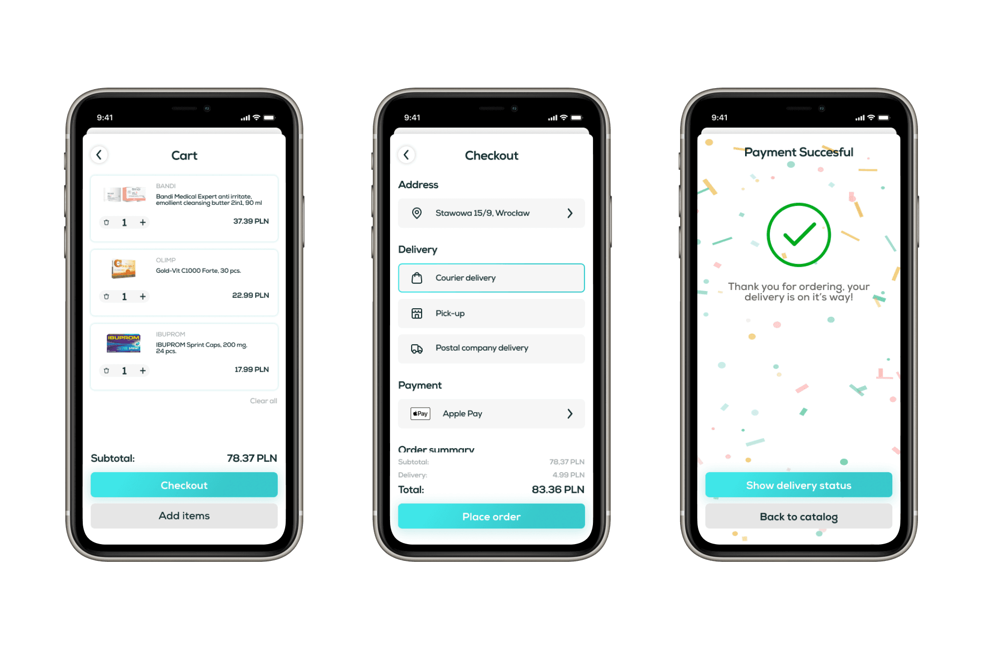
Cart & payment
Fast online payment based on survey’s results is very important. You can pay with Apple Pay and Google Pay as well as entering your bank credit card details.
16
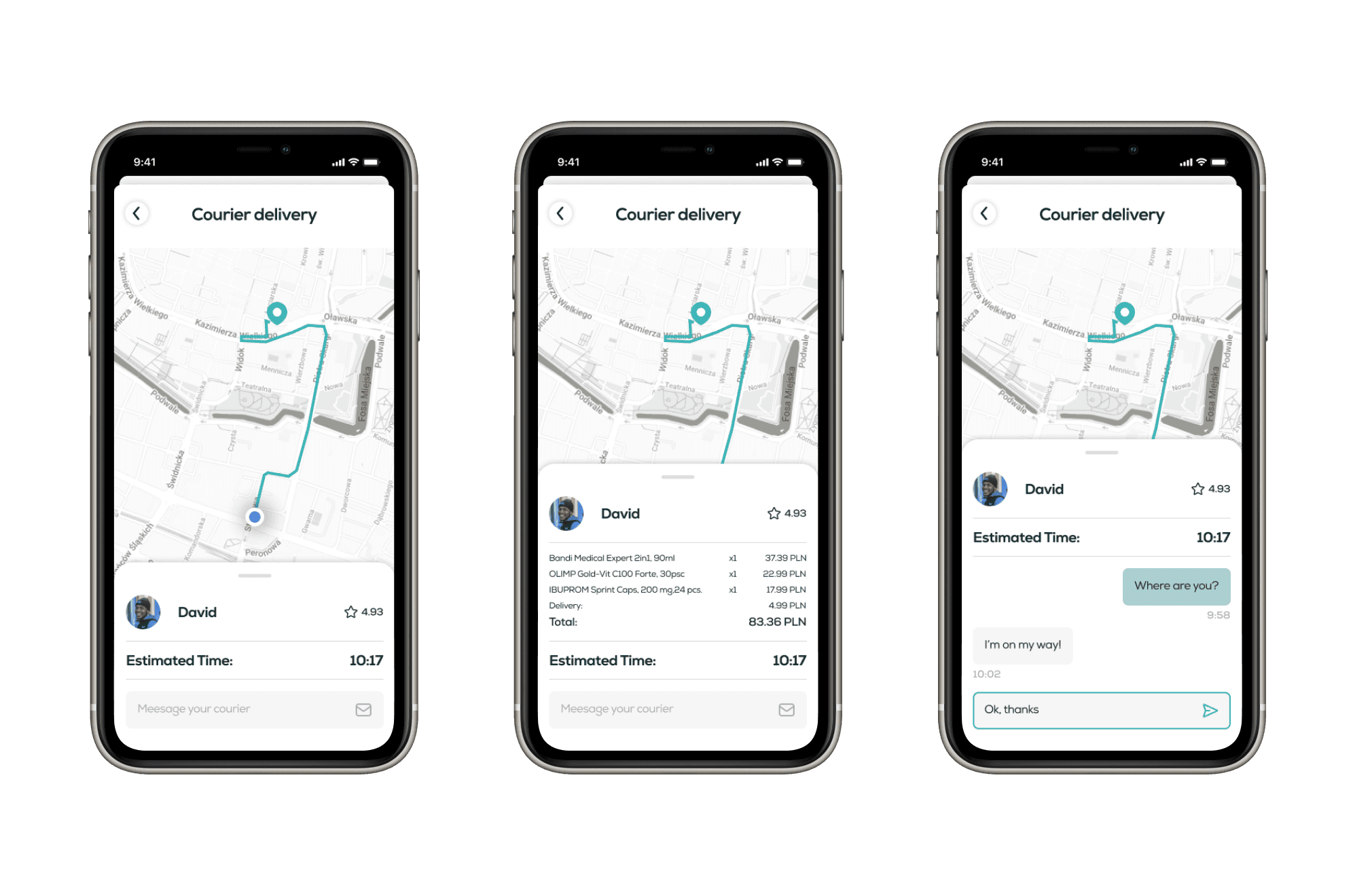
Courier delivery
Courier delivery was an important option based on my research. It shows a really comfortable way of using, known from food-based delivery apps, which helps majority of users in understanding the principles.
