SKI4YOU - Newcoming E-Commerce Giant
Transformed from an outdated platform into a modern, high-functioning e-commerce experience. As the sole architect of this overhaul, I leveraged the latest design trends to create a clean, engaging interface that not only showcases a vast array of products but also simplifies the path to purchase. This site is now a prime destination for skiing enthusiasts, designed to encourage exploration, interaction, and confident decision-making by customers.
Join me as we explore the key features that set SKI4YOU apart in the competitive online marketplace of 2023.
01
The Concept & Story
Background: SKI4YOU’s previous website was outdated, presenting both aesthetic and functional challenges that hindered user engagement and e-commerce success. The project was initiated to modernize the website, making it relevant and competitive in today's market.
Inspiration: The redesign drew inspiration from leading e-commerce platforms, focusing on user engagement, visual storytelling, and streamlined user experiences that facilitate effortless navigation and interaction.
Target Audience: Ski enthusiasts and winter sports participants seeking a seamless online shopping experience for high-quality skiing equipment and accessories.
02
Key Features & Funcionality
In the redesign of the SKI4YOU website, I focused on developing a series of innovative features that not only enhance the aesthetic appeal but also significantly improve functionality and user engagement. Each feature was carefully crafted to address specific user needs and business goals, from simplifying navigation to enhancing the shopping experience. Below, I’ll detail the standout features of the website, showcasing how they contribute to a seamless user journey and ultimately, higher conversion rates. This section will include visual aids and demonstrations to provide a clearer understanding of the practical impact these features have on the everyday experience of our users.
(A)
Dynamic Homepage Layout
The homepage is designed to be rich yet clutter-free, featuring a video slider, bestsellers, distinct categories for male and female products, and a daily product spotlight. The layout aims to increase brand awareness and conversion rates by showcasing the best products and deals.
(B)
Header Functionalities
The header is enhanced with interactive animations for search and shopping cart functionalities, offering product suggestions to enhance user experience and ease of purchase.
(C)
Collection Page Design
Collection pages are designed with clarity and user-friendliness in mind, featuring expandable filters, SEO-optimized text about the brand or collection, and strategically placed cross-sell opportunities.
(D)
Detailed Product Pages
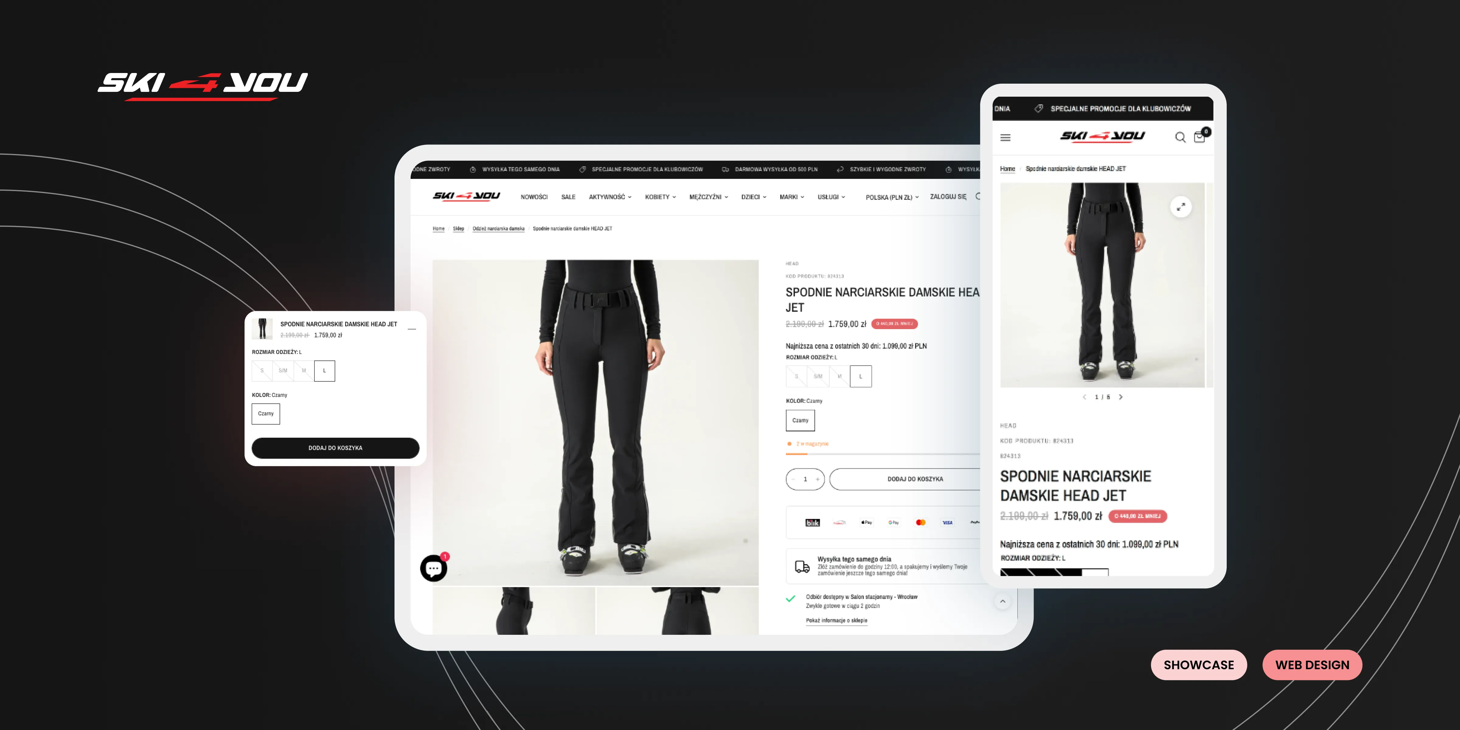
Product pages include a collage photo gallery, prominent product titles, variable options, and a visible count of remaining stock to induce urgency (FOMO). Additional selling points like same-day shipping, easy returns, and FAQs are also highlighted to reinforce buyer confidence.
(E)
Interactive Product Views
An expandable product view appears in the corner of the screen on product pages when users scroll down. This feature ensures that purchasing options are always visible, enhancing the likelihood of conversion.


