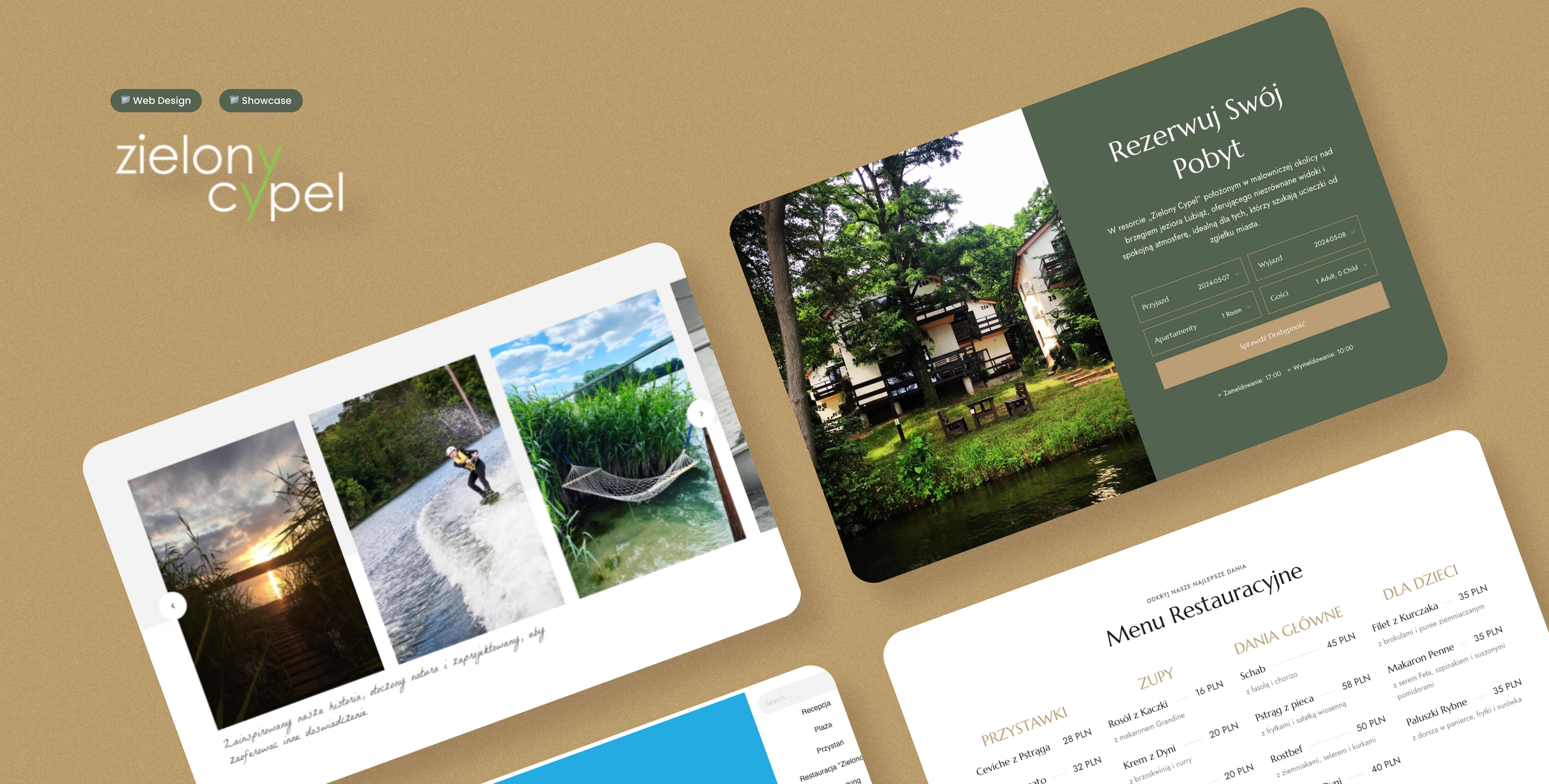
Zielony Cypel - Pearl on the majestic lake
The Zielony Cypel project was envisioned as a digital gateway to a luxurious hotel experience, reflecting the elegance and serene environment of the resort itself. The primary goal was to create a website that not only serves as a booking platform but also as a comprehensive showcase of the resort's offerings, from accommodations and amenities to special events and investment opportunities.
01
The Concept & Story
Inspiration: The design of the Zielony Cypel website was inspired by the unique character and atmosphere of the resort itself. Nestled in a picturesque location, the resort is synonymous with tranquility and luxury, traits that the website needed to convey. The name "Zielony Cypel," meaning Green Cape, evokes images of lush, verdant landscapes and a peaceful retreat from the hustle and bustle of daily life. These ideas formed the cornerstone of my design narrative.
Narrative: To translate this serene and opulent experience into a digital format, I chose a color palette of green and gold, reflecting both the name and the luxurious services offered. The design narrative revolves around providing a seamless, intuitive user experience that mirrors the calm and enjoyable experience guests would expect at the resort. Every element, from typography to layout, was selected to evoke elegance and simplicity, allowing the content and imagery to shine.
Visual Storytelling: Utilizing custom photography and drone footage, the website tells the story of Zielony Cypel through immersive visuals. Each page is designed to be not just informative but also visually compelling, encouraging users to explore further and connect emotionally with the resort.
02
Key Features & Funcionality
The Zielony Cypel website integrates multiple key features, each designed to enhance the user experience and showcase the resort's offerings. From interactive tools to detailed pages on amenities, the website is structured to provide a comprehensive overview of the resort while ensuring ease of use and accessibility.
(A)
Homepage Design
Structure: Features a dynamic header with sidebar navigation, prominent call and reservation buttons, and a captivating drone-shot video of the resort.
Content Highlights: A searchable booking bar, visual galleries, additional promotional videos, a room slider, and essential resort features such as weddings, activities, and dining options.
Interactive Elements: Testimonials, detailed amenity listings, newsletter signup, and a comprehensive footer for additional navigation.
(B)
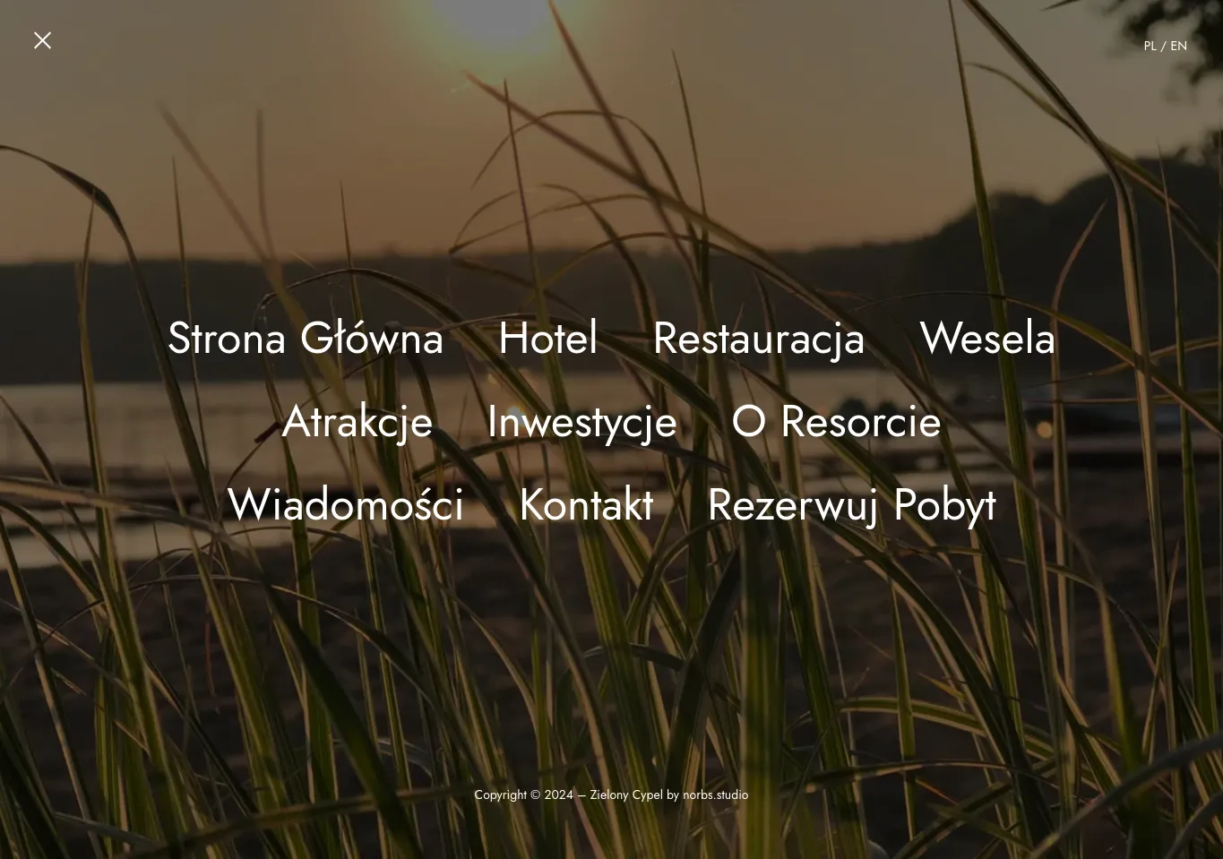
Dynamic Sidebars
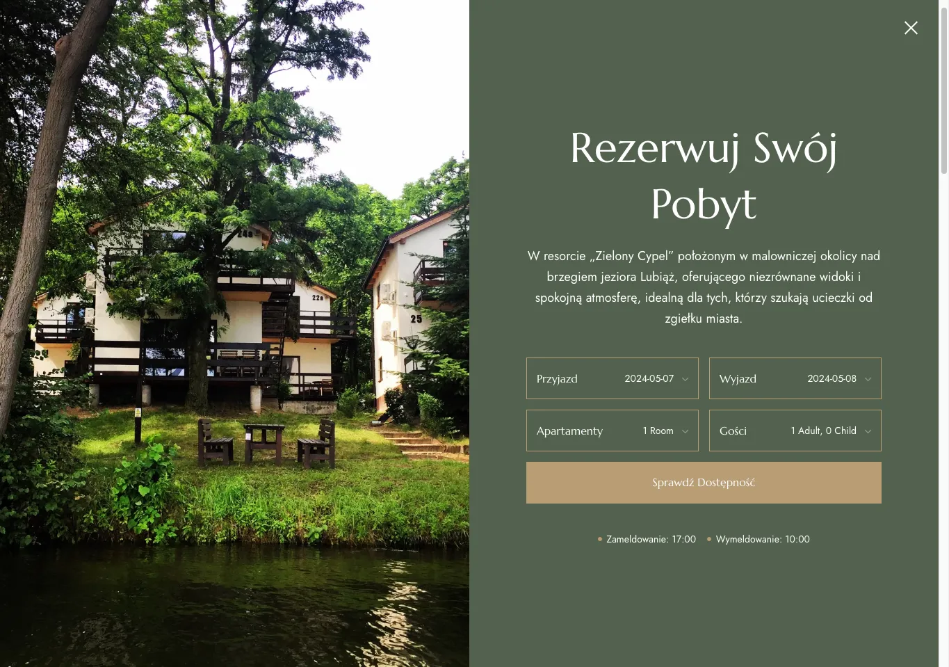
To enhance user experience, the traditional top navigation menu is replaced with a dynamic sidebar. This design choice not only maximizes screen real estate but also simplifies accessibility, making it easier for users to navigate through the site’s extensive offerings. Additionally, I integrated an off-canvas booking system into the sidebar. This feature, which slides out when activated, provides a seamless and unobtrusive way for users to book their stay without ever leaving the current page they are viewing. The off-canvas system ensures that the booking process is accessible from anywhere on the site, maintaining a clean and uncluttered interface while offering full functionality.
(C)
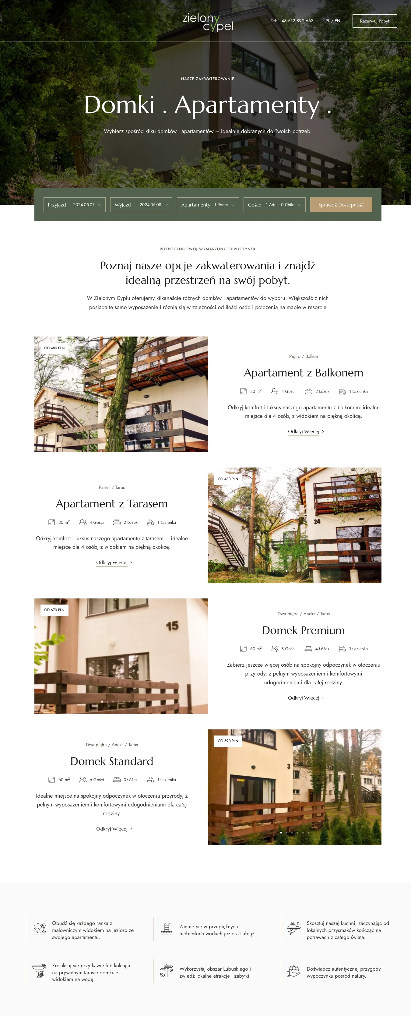
Accommodation Listings
Includes detailed information on homes, rooms, and apartments available for booking, with clear pricing and essential information.
(D)
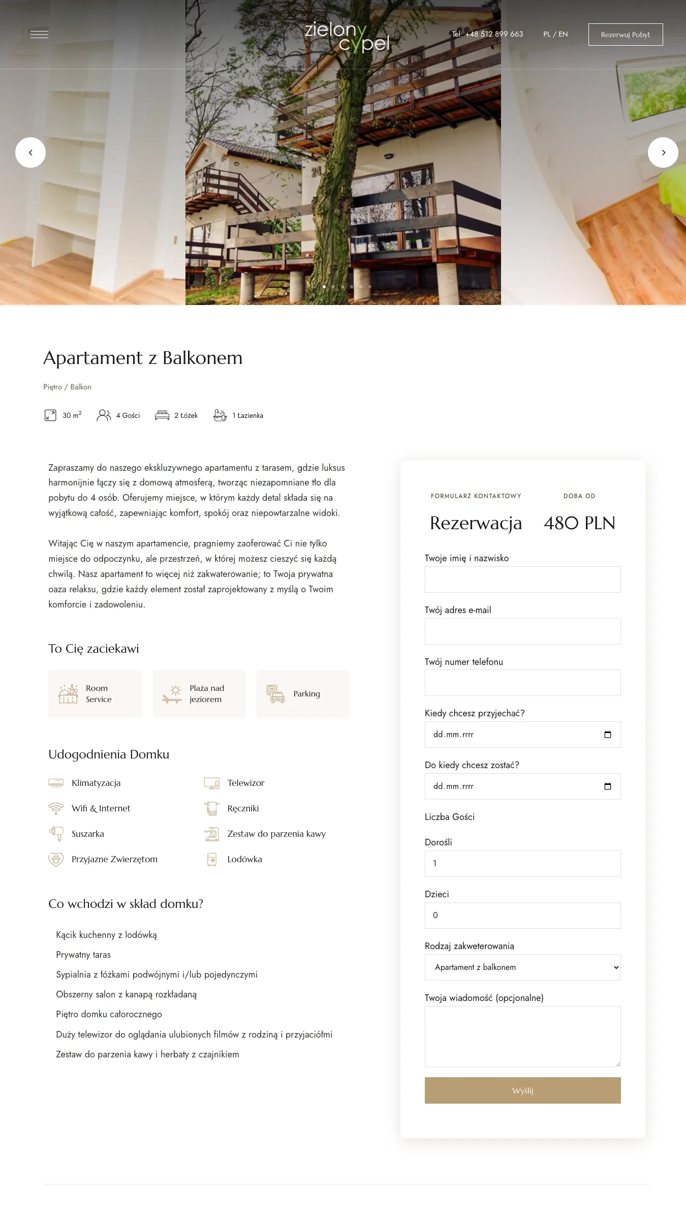
Detailed Product Pages
Focuses on individual apartment details with a sidebar for easy booking.
(E)
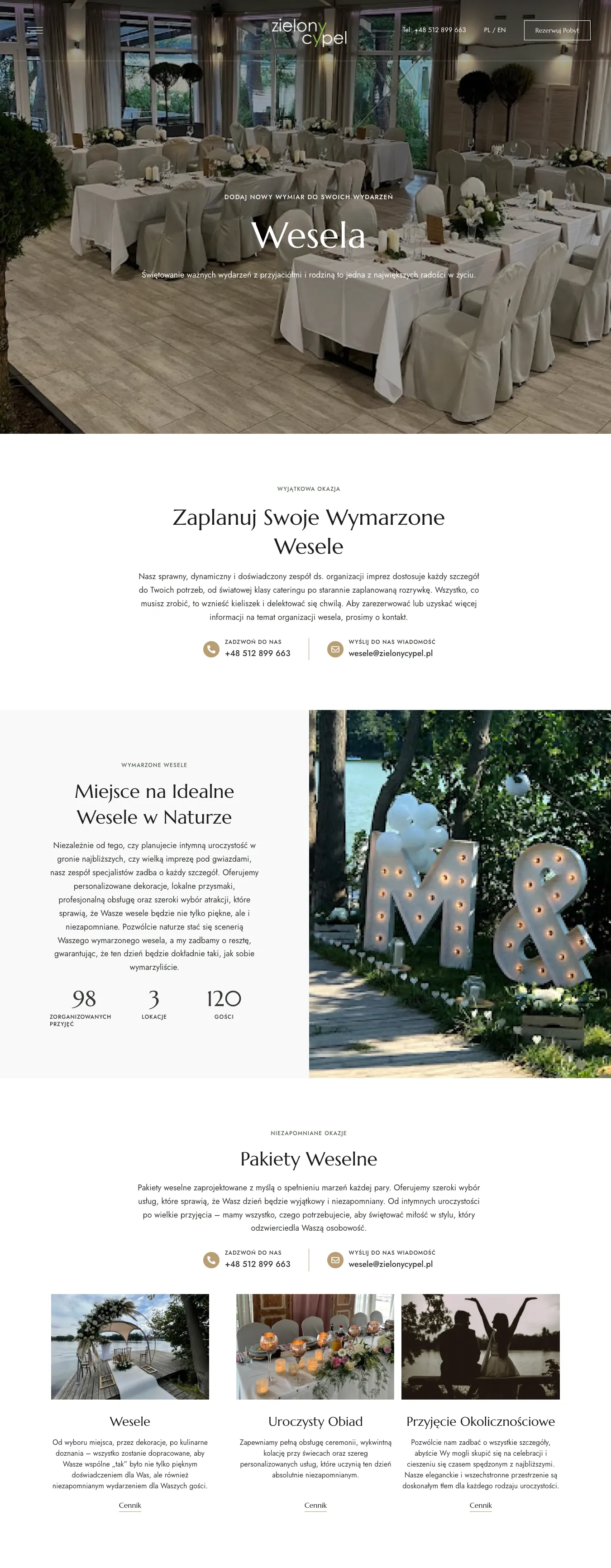
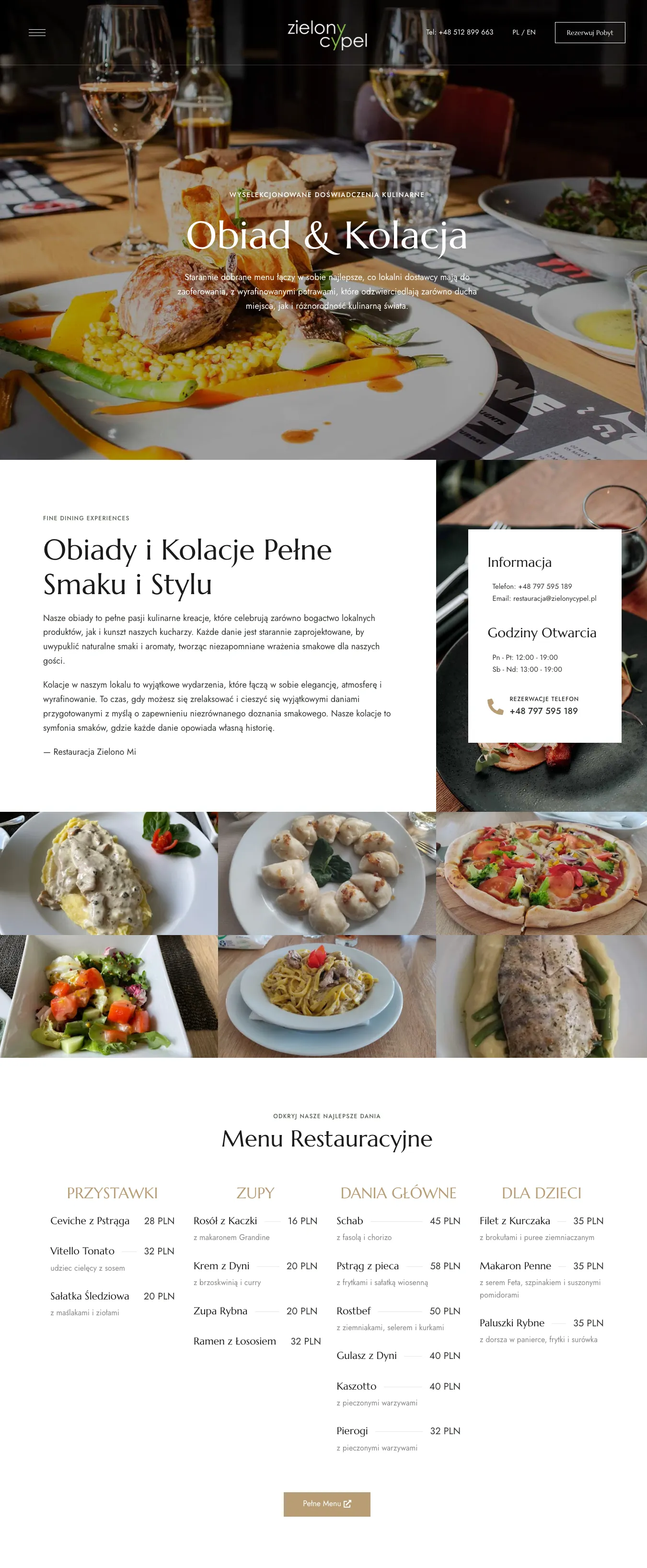
Specialized Pages for Services and Amenities
Each service, from weddings to dining and activities, has its own dedicated page, which provides detailed information and visuals. This helps potential guests or event planners find exactly what they’re looking for quickly and efficiently.
(F)
Investment Interactive Map
Perhaps the most technologically challenging feature was the interactive map for potential investors. It allows users to view and select properties within the resort for investment purposes, providing detailed information and availability status in real time.
03
Summary
The Zielony Cypel website redesign represents a significant advancement in luxury resort web design, combining elegance with functionality. As a solo designer, I was tasked with creating an inviting digital space that mirrors the resort's serene and luxurious atmosphere. Through the use of a refined color palette, intuitive navigation, and dynamic multimedia content, the website offers an immersive user experience that not only showcases the resort’s offerings but also simplifies the booking process.
Key innovations such as the off-canvas booking system and interactive resort map highlight my commitment to enhancing user engagement and operational efficiency. These features ensure that from the moment users land on the homepage, they are engaged with an intuitive and seamless interface that encourages exploration and interaction.
The completion of this project has not only met but exceeded client expectations, delivering a platform that elevates the brand and enhances user satisfaction. This project serves as a testament to my capabilities in UX/UI design, showcasing my ability to integrate complex functionalities with aesthetic precision in a manner that appeals to both the client and their guests.
